Inequality of income in Iran after subsidy reform: the view from the Palma ratio
A while back a friend asked me if the Palma ratio — the ratio of the incomes of the top 10% to the bottom 40% — is a good indicator of inequality in Iran. I waited until I had the data for 1392 (2013/2014) to answer his question. In the meantime, I came across a banner headline in the economics newspaper, Taadol, which read something to this effect: “Subsidy reform deepens inequality.” The claim itself was nothing new, but the reported Gini indices were: I had not seen anyone report Gini coefficients as high as 0.53 for the post-revolution Iran, and it turns out that they do not exist.
The evidence I have comes from the same source of data used by everyone else — the Household Expenditures and Incomes Survey (HEIS), which are available online. These data show that, using any of the usual measures, inequality has declined after the subsidy reform. How much of the decline is due to the reform, I do not know.
Back to my friend’s question, the answer is yes. The Palma Ratio (PR), named after the Chilean economist Gabriel Palma, which is fundamentally a comparison of the fortunes of the rich and the poor, registers a large decline in the share of the expenditures of the top 10% to the bottom 40% after 2010. The figure below shows the PR for the last 20 years: staying between 2-2.5 until 2010 before dropping rapidly to reach 1.6 in 2013.
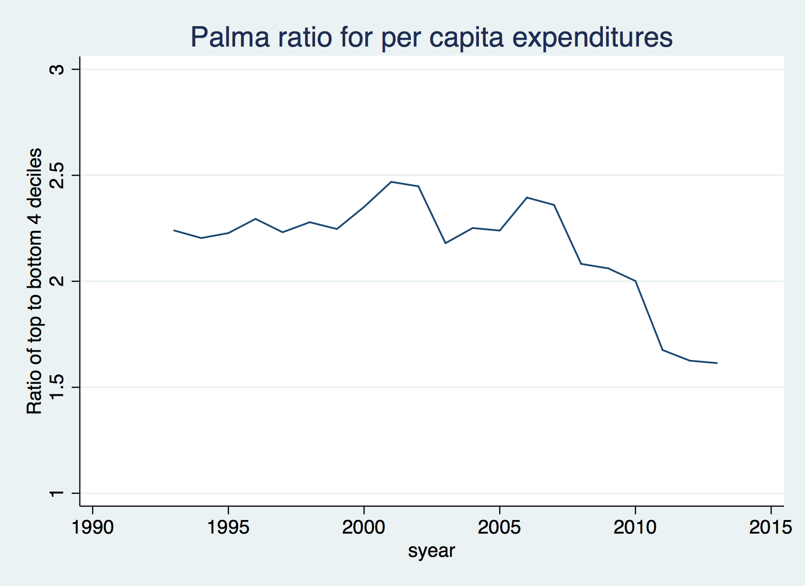
Source: HEIS files, Statistical Center of Iran.
If you cannot see the graph, please click here.
The PR is not always a good measure of overall inequality, but happens to work well for the case of Iran because the share of the rest of the population — deciles 5-9– has remained remarkably constant over time, consistent with Palma’s expectations for other countries. This is clearly seen in the chart below:

You can see the graph also here.
My own hunch is that the improvement we see in the PR, as well as in other measures of inequality, since 2010 is in part caused by the recession, which usually hits the rich hardest (which seems fair since they have the means to deal with it). There is a slight rise in the share of the middle class around the same time, a sign that they gained at the expense of the rich.
The view from the Gini and General Entropy (GE) indices is consistent with that from the Palma. See my third chart for the Gini and two measure of the GE, GE(-1), which is sensitive to incomes at the bottom of the distribution, and GE(2), which is more sensitive to incomes at the top. The GE(-1) tracks the Gini quite well until 2010, but declines more steeply thereafter, most likely because the lower income groups gained in share. The Gini declined from 0.42 in 2009 (1388) to 0.37 in 2012 and 2013 (1391 and 1392). As I have argued elsewhere, this may well be a direct result of the cash transfers paid in compensation for the price increases of energy and bread in late 2010.
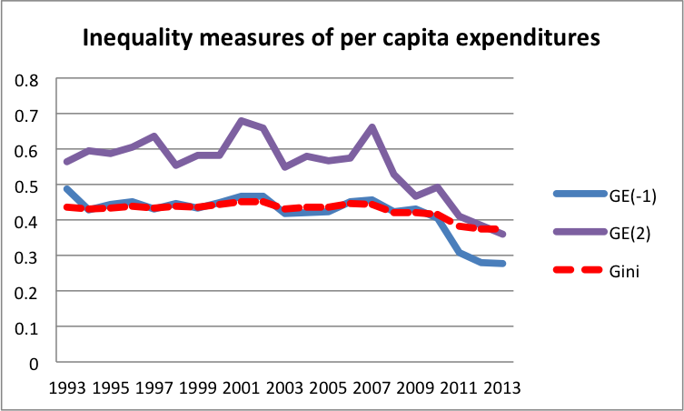
The sharp decline in GE(2) that we notice in this figure is consistent with the behavior of the share of the rich during economic slowdowns, which seems to decline during economic uptakes, as it did in 2001 and 2007, both of which were led by rising oil prices.
The flattening of the curves for inequality in 2013 is also likely because the effect of cash transfers have eroded because of inflation. Further energy price increases without compensation will likely reverse this trend as the poor spend a larger proportion of their incomes on energy products and bread compared to the rich.
A note on my method of calculation: I used the Stata program ineqdeco for the computation of the Gini and GE indices; per capita expenditures are total gross expenditures divided by household size; and the shares of various deciles are computed using frequency weights obtained by multiplying the sampling weight supplied by the Statistical Center of Iran by household size.


[…] sanctions campaign targeting Iran’s economy. Still, between 2007 and 2012, thanks in part to redistributive government policies, the income share of Iran’s rich — those in the top 5 percent of households — decreased while […]
[…] concentrating on Iran’s financial system. Nonetheless, between 2007 and 2012, thanks partly to redistributive government policies, the revenue share of Iran’s wealthy — these within the prime 5 % of households — decreased […]
[…] around arbitrarily. My favorite measure of poverty is the Palma Ratio, which I discussed in a previous post. The graph below updates the data from that post to […]
[…] around arbitrarily. My favorite measure of poverty is the Palma Ratio, which I discussed in a previous post. The graph below updates the data from that post to […]
[…] around arbitrarily. My favorite measure of poverty is the Palma Ratio, which I discussed in a previous post. The graph below updates the data from that post to […]
Many thanks for the very interesting article. I don’t think a rise in unemployment and a decline in participation rates can offer support to the argument. There is a sharp decline in the ratio in 2010, but the actual implementation of the scheme and its first impact was in 2011. What actually happens is that the curve flattens after the implementation of the scheme, the decline stops and immediately flattens.